Waking up to the Shopify newsletter titled, “don't make these 7 mistakes in your E-Commerce business” was practically an indictment for a very serious transgression of growing a small business, failing to have a logo. As artists, we often focus entirely on our work and not our businesses, marketing, or branding, so It was time to grab a morning coffee, open up Inkscape, and design a logo.
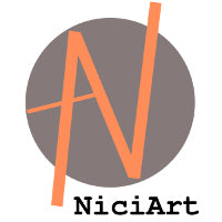
The obvious choice is the old tried and true circle logo with the company's first letter, in this case 'N,' placed prominently at the center of the circle. Seeing just how trite and boring our logo appeared even at first glance, I decided to draw the “N” instead of using one of Inkscape's pre-installed fonts. Still, a simple “N” in a circle was delivering the message, “this is our logo and we just don't give a damn” which is just opposite message of what we are trying to convey to our prospective shoppers. A simple fix was to expand the “N” so that members extended beyond the circle to express the concept that we are different and are willing to step outside the circle. Having absolutely no background in web design and branding put me at quite a disadvantage in coming up with a colour scheme, however my initial inclination to use gray and orange seemed to be justifyable after a Google search revealed “In Buddhism, orange (or more precisely saffron) was the colour of illumination, the highest state of perfection” from a Wikipedia entry. One single concept, "perfection" embodied in the colour orange would be a prefect compliment to our 'N' scheme. The grayish background simply represents metal which is our medium of choice for creating jewelry.
Finding the proper placement and representation for the 'Art' portion of our company proved to be a bit more challenging. Simply crossing the vertical and diagonal members of the 'n' would create an overpowering 'A' which could be construed as the symbol for Anarchy. While we were punks in our youthful Sturm und Drang years and still are at heart, such symbolism is far from the professional ideals that we are seeking in our logo. The revision for the prominent 'A' cross member was a much more subdued line that completes the 'A' portion of logo. Just to avoid any confusion and further distance ourselves from any other possible interpretations of the letter 'A,' the horizontal cross member has been placed asymetrically extending towards the Southwest and coincidentally has further meaning as a compass pointing towards our home stomping grounds in New Mexico and Arizona where our jewelry business found its inspiration.
Simple, succinct, and featuring absolutely no frills, our logo design definitely skips the annoying whistles and bells, but still felt incomplete and had a frustrating cliff hanger ending as if to say tune in next week the exciting conclusion of logo design day. Having already spent much of the morning hours cheered on and motivated by overpriced Whole Foods organic coffee, there certainly was not going to be another episode next week as my patience and caffeine budget was already stretched to the max. The eureka moment was realizing the name of the company, NiciArt, would be absolutely required to complete the logo. Experimenting with fonts proved to be an exercise in boring repetition until Nici suggested American Typewriter Bold which coincidentally is our favourite font for engraving. At last, the logo was complete.
 Finding the proper placement and representation for the 'Art' portion of our company proved to be a bit more challenging. Simply crossing the vertical and diagonal members of the 'n' would create an overpowering 'A' which could be construed as the symbol for Anarchy. While we were punks in our youthful Sturm und Drang years and still are at heart, such symbolism is far from the professional ideals that we are seeking in our logo. The revision for the prominent 'A' cross member was a much more subdued line that completes the 'A' portion of logo. Just to avoid any confusion and further distance ourselves from any other possible interpretations of the letter 'A,' the horizontal cross member has been placed asymetrically extending towards the Southwest and coincidentally has further meaning as a compass pointing towards our home stomping grounds in New Mexico and Arizona where our jewelry business found its inspiration.
 Simple, succinct, and featuring absolutely no frills, our logo design definitely skips the annoying whistles and bells, but still felt incomplete and had a frustrating cliff hanger ending as if to say tune in next week the exciting conclusion of logo design day. Having already spent much of the morning hours cheered on and motivated by overpriced Whole Foods organic coffee, there certainly was not going to be another episode next week as my patience and caffeine budget was already stretched to the max. The eureka moment was realizing the name of the company, NiciArt, would be absolutely required to complete the logo. Experimenting with fonts proved to be an exercise in boring repetition until Nici suggested American Typewriter Bold which coincidentally is our favourite font for engraving. At last, the logo was complete.
